 Amber Naz
Quick Summary
Open your store on your phone right now. Does the hero image pop in late, or the “Add to cart” button sit too close to another link? Does checkout feel like a chore? Shopify themes are responsive out of the box, but a responsive theme is not the same as a store that works well on a phone.
Shopify mobile optimization is the work of finding where your store frustrates phone shoppers and fixing it. This guide shows you how to check how your store performs on mobile, then fix the three most common problems: slow images, hard-to-tap buttons, and clunky checkout.
Why Shopify mobile optimization is worth your time
Three reasons stand out:
- Shoppers feel it first. A slow page or a missed tap on a small screen costs you the sale before any marketing has a chance to work.
- Search engines see the mobile version. Google predominantly uses the mobile version of a page for indexing and ranking. If your mobile experience is thin or slow, that is the version being judged.
- Shopify ties speed to discoverability. Shopify’s own guidance says pages that perform poorly on Core Web Vitals might rank lower, even if the store is otherwise optimized for search.
No single fix guarantees a ranking jump. What you can control is whether phone shoppers have a fast, clear path from landing page to purchase.
Step 1: Check how your store performs on phones
Diagnose before you fix. Otherwise you may spend a weekend compressing images when the real problem is a checkout field.
Start with real-user data
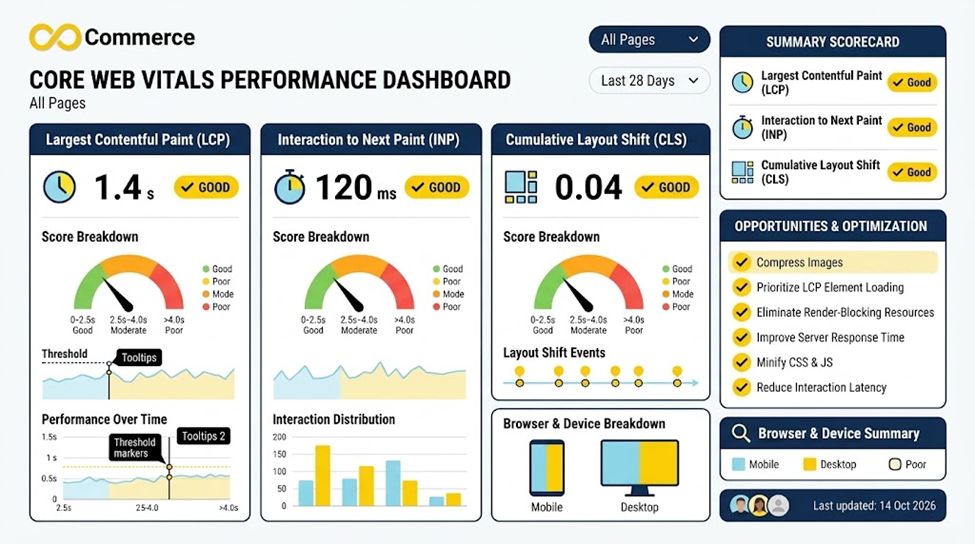
Shopify’s web performance reports show how real visitors experience your store across the three Core Web Vitals. Each metric is ranked Good, Moderate, or Poor, and the summary appears on the Themes page of your Shopify admin. Two notes:
- Remove password protection first, because the dashboard needs real visitor traffic to fill in.
- Check the device split. Look at mobile separately from desktop.
Google’s published thresholds for “good” are measured at the 75th percentile of visits:
| Metric | What it measures | Good |
| Largest Contentful Paint (LCP) | Loading speed | 2.5 seconds or less |
| Interaction to Next Paint (INP) | Responsiveness | 200 milliseconds or less |
| Cumulative Layout Shift (CLS) | Visual stability | 0.1 or less |
Google Search Console’s Core Web Vitals report and PageSpeed Insights give you a second opinion. Scores can differ between tools because they use different data and time windows, so look for the pattern, not one exact number.
Test on a real phone
Preview tools help, but a real device shows problems a desktop browser can hide. Walk through this path on your own phone, on mobile data as well as Wi-Fi:
- Land on the homepage from a link and note how long the first screen takes to look finished.
- Open a collection page and a product page. Change a variant and adjust the quantity.
- Add to cart, open the cart, and apply a discount code.
- Go through checkout to the payment step.
Write down every moment you hesitate, mis-tap, or wait.
Watch what mobile shoppers actually do
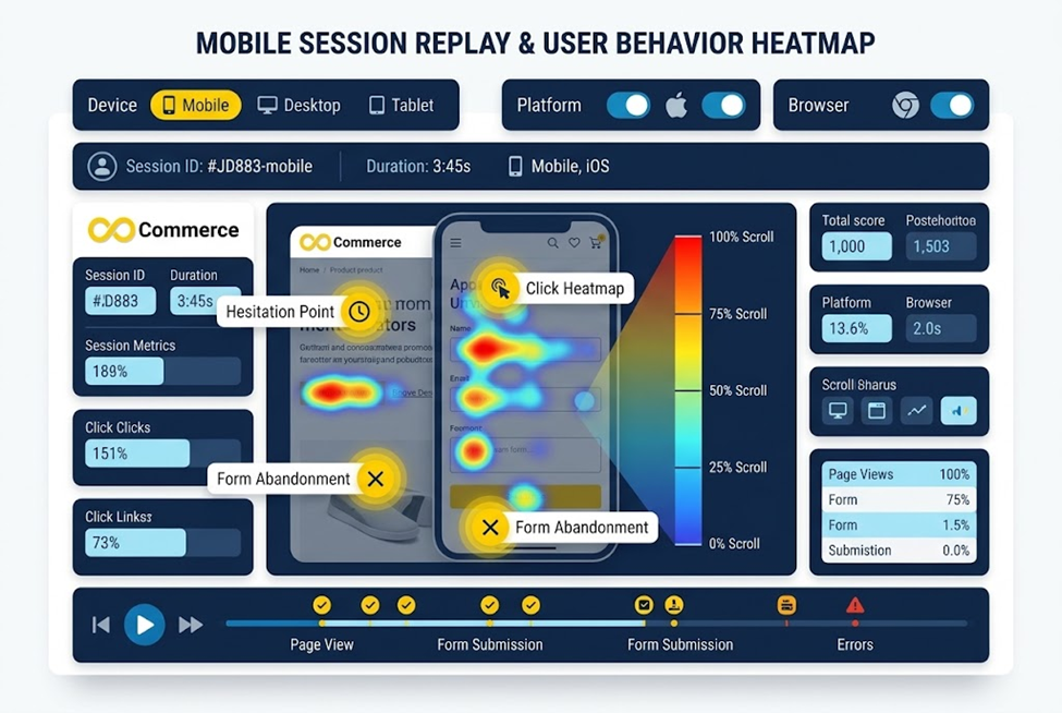
Metrics tell you that something is slow. Session recordings show you where shoppers get stuck. The Infinite Microsoft Clarity & Heatmap app offers session replays and click and scroll heatmaps, with filters to segment visitors by device. Filter to mobile, then watch recordings of sessions that reached the cart but didn’t buy. Look for:
- Repeated taps on something that doesn’t respond.
- Pinching to zoom because text or buttons are too small.
- Scrolling past a section that should have been seen.
- Abandoning at the same step again and again.
Match the symptom to the fix
| What you notice | Likely cause | Go to |
| Blank space, then a late-appearing hero image | Hero image lazy-loaded or oversized | Step 2 |
| Page jumps as it loads | Images or apps without reserved space | Step 2 |
| Mis-taps, pinch-zooming | Small or crowded buttons and icons | Step 3 |
| Drop-off after “Checkout” | Extra fields, missing express options | Step 4 |
Step 2: Fix slow images and heavy pages
On most stores, images are the biggest contributors to a slow mobile LCP. These fixes come first.
Never lazy-load the hero image
Lazy loading is great for images far down the page, but Shopify’s theme guidance warns against applying it to the main image in the first viewport. Lazy-loading it delays the very element Google measures for LCP. Shopify’s image_tag filter handles this automatically for early sections, but custom or edited theme code can break it. If you’re comfortable in the theme code, or have a developer, check these two things:
- The hero or main product image loads eagerly, and ideally carries fetchpriority=”high”. Shopify’s guidance on this attribute says to use it on the LCP image only, one per page, and never together with lazy loading.
- Below-the-fold images do use lazy loading.
Send phones appropriately sized images
A full-width desktop banner served to a phone wastes bandwidth. Use your theme’s responsive image settings, and where your theme supports it, set a separate mobile image for large banners. Keep product photos reasonably sized before uploading, and avoid auto-playing background video on the first screen of a mobile page.
Stop the page from jumping
Layout shift happens when an image, banner, or app widget appears and pushes content down. Reserve space by giving images explicit dimensions, which Shopify’s image filters do by default. Then watch for late-loading elements such as announcement bars, review widgets, and popups.
Audit your apps
Shopify notes that each feature you add can affect your store’s performance, including apps, carousels, videos, and social feeds. Make a list of every installed app and ask whether it earns its place. Remove the ones you don’t use, then check your theme code for leftovers from apps you’ve already uninstalled. Measure again after adding any new app, including analytics tools.
If your theme is heavily customized and old, consider an up-to-date Online Store 2.0 theme. Shopify says all of its own free Online Store 2.0 themes are optimized for web performance.
Step 3: Make buttons, menus, and forms easy to tap
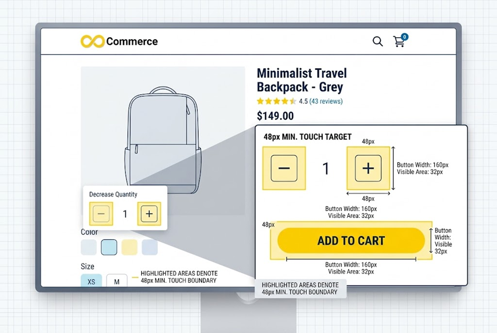
Fingers are less precise than cursors. If your store was designed on a desktop monitor, some controls are probably too small for a thumb.
Know the numbers
Google’s tap target guidance recommends:
- A minimum tap target of about 48 by 48 CSS pixels.
- About 8 pixels of spacing between targets, so a tap on one doesn’t hit another.
A 24px icon can stay visually small. Add padding to bring its tappable area up to 48px.
Check the usual suspects
Tap targets tend to fail in the same places on Shopify stores:
- Cart and search icons in the header
- Quantity plus and minus buttons
- Variant swatches and size buttons that sit close together
- Filter and sort controls on collection pages
- Close buttons on popups and drawers
- Footer links stacked tightly
If a fix needs a code change, duplicate your theme first and test there. A common pattern targets touch screens specifically:
css
@media (pointer: coarse) {
/* Replace with your theme’s actual selector */
.your-icon-button {
min-width: 48px;
min-height: 48px;
}
}
Your theme’s class names will differ, so use browser developer tools to find the right selector.
Keep navigation and popups simple
- Keep the mobile menu short, with search easy to reach.
- Put the add-to-cart button where a thumb can reach it, and make sure it’s visible without hunting.
- Delay or simplify full-screen popups on mobile. They block content and are easy to mis-tap, and Google has guidelines on intrusive interstitials.
- Don’t disable pinch-to-zoom. Many shoppers rely on it.
Step 4: Smooth out your mobile checkout
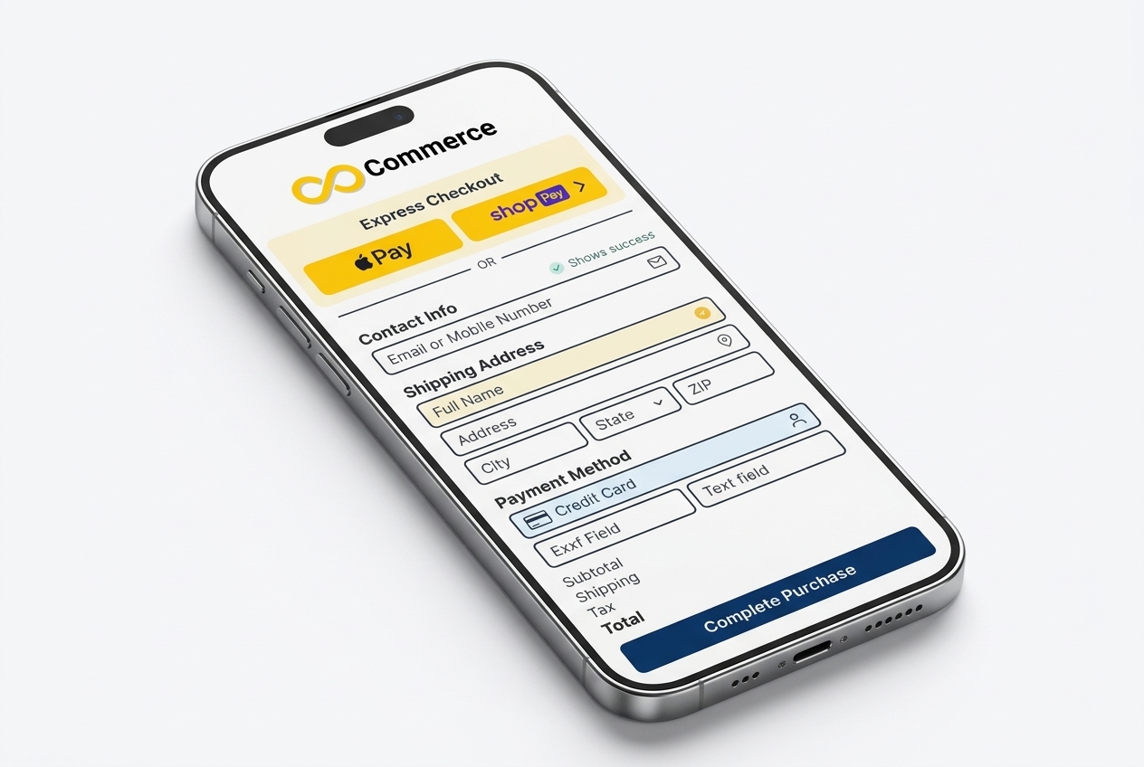
One limit up front: Shopify hosts checkout, so you can’t redesign it freely. That’s good for reliability, but it means your levers are mostly settings. They’re worth using.
Turn on express checkout
Accelerated checkouts save customer payment and shipping details so returning customers can pay faster. You can activate buttons for Shop Pay and for providers that offer them, such as Apple Pay, Google Pay, Amazon Pay, and PayPal. They can also appear on product pages, letting customers skip the cart. Which button a shopper sees depends on their device, browser, and payment history, so you can’t force a specific one to show. Availability also depends on your payment provider and region, so check Settings > Payments in your admin. If you are still deciding which provider to use, our comparison of Shopify vs Stripe payments, fees and features can help.
Trim the form
In Settings > Checkout, Shopify’s form options let you make some fields required, optional, or hidden, though not all fields can be edited. Every extra field is more typing on a small keyboard, so review:
- Contact method: choose the option that fits your store.
- Phone number: Shopify advises requiring it only if your payment provider or shipping carrier needs it.
- Customer accounts: consider optional accounts so first-time buyers aren’t forced to register.
Shopify’s checkout also offers a “Save this information for next time” option that lets the customer’s browser fill in contact and shipping details on return visits.
Remove surprises before payment
Make sure shipping rates, delivery times, and returns information are clear on the product and cart pages. Unexpected costs at the last step are a common reason people leave. Then test the whole flow yourself on a phone, using both a wallet and a card, and with a discount code.
Step 5: Re-test and keep it fixed
Mobile optimization is not a one-time project:
- Change one thing at a time so you know what worked.
- Give real-user data time. Core Web Vitals come from real visits over a window of weeks, so improvements won’t show up instantly.
- Confirm with recordings. Check mobile sessions again to see whether the hesitation points are gone.
- Re-run your phone checklist after every new app, theme update, or big campaign page.
Quick Shopify mobile optimization checklist
- Mobile Core Web Vitals reviewed (LCP ≤ 2.5s, INP ≤ 200ms, CLS ≤ 0.1)
- Hero image is not lazy-loaded and is appropriately sized
- Unused apps and leftover code removed
- Tap targets around 48px with roughly 8px spacing
- Popups don’t block the first screen on mobile
- Express checkout buttons enabled
- Checkout fields reviewed and trimmed
- Full purchase path tested on a real phone
- Mobile session recordings reviewed
Conclusion
Strong Shopify mobile optimization comes down to a simple order of operations: measure, fix the biggest friction first, then re-test. Start with your real-user data, watch how phone shoppers move through your store, and work through images, tap targets, and checkout in that order.
Want to see exactly where your mobile shoppers get stuck? The Infinite Microsoft Clarity & Heatmap app gives your Shopify store session replays and click and scroll heatmaps you can filter by device. Install it, review a week of mobile sessions, and let what shoppers actually do guide your next fix. Questions about setup? Contact the Infinite Commerce team.
FAQs
Shopify themes are responsive, and Shopify says its free Online Store 2.0 themes are optimized for performance. But images, apps, popups, and customizations you add can still slow the mobile experience or crowd the layout. Test your actual store, not just the theme demo.
Google’s “good” thresholds are an LCP of 2.5 seconds or less, an INP of 200 milliseconds or less, and a CLS of 0.1 or less, measured at the 75th percentile of real visits. Google uses the same thresholds for mobile and desktop.
Use three layers. Check Shopify’s web performance reports for real-user data, walk through the purchase path on a real phone, and review mobile session recordings and heatmaps to see where shoppers struggle.
It can help, but it’s no guarantee. Google predominantly uses the mobile version of your pages for indexing and ranking, and Shopify says poor Core Web Vitals can hold pages back. Page experience is one part of the picture alongside content quality and relevance. The more reliable payoff is a store that converts better for the visitors you already have.
Partly. You can enable express checkout methods and edit some form fields in Settings > Checkout, but Shopify controls the overall checkout design and not every field can be changed.
Heatmaps show where mobile visitors tap and how far they scroll, and session replays show the moments they hesitate or leave. That helps you decide which fix to make first instead of guessing.
